Why Negative Space Changes the Way We Read an Image
Negative space changes how we read an image by clarifying edges, grouping forms, and directing attention. Learn to notice those effects in any composition.
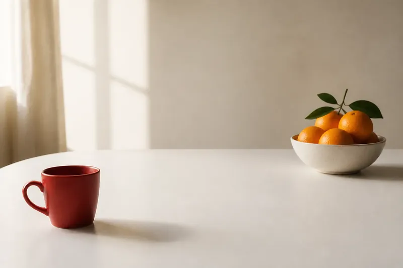
A red cup sits near the edge of a white table, with a broad stretch of bare tabletop between it and a bowl of oranges. Your eye may go to the cup first, then travel across the gap to the fruit. Move the cup closer to the bowl, and the same objects begin to feel like a group. Negative space helps produce that shift. It is not simply what an image leaves out; it is part of how the image asks to be read.
Look at a portrait, a poster, or a room in a painting and notice the areas without named objects. Their boundaries may be formed by a shoulder and a wall, a vase and a tabletop, or a figure and the frame. These spaces carry visual weight because we read edges, distances, and proportions together. Start by noticing figure and ground, then compare the gaps and consider how framing changes the space around a subject.
Figure and ground share the same edge
In a simple image, the figure is the object that seems to sit forward; the ground is what seems to sit behind it. But the boundary between them belongs to both. A dark profile against a pale wall outlines the face, while the pale shape beside the profile is also defined by that contour. The edge does two jobs at once.
This is why an image can seem to change when you attend to its empty areas. A narrow white wedge between a person’s arm and torso might first look like a small patch of background. Follow its outline, though, and it becomes a crisp shape with its own silhouette. The arm may suddenly seem bent more sharply, or the torso may appear narrower. Nothing in the depicted figure has changed; your attention has switched to the shape the figure and background make together.
Artists can use this exchange to make a composition legible or unsettling. Clear separation lets you distinguish a hand from a sleeve, a bird from the sky, or one letter from another. When forms nearly touch, their outlines can merge. You may hesitate over what belongs to which object, and that hesitation becomes part of the image’s character.
Trace one edge with your eyes, then follow the shape on the opposite side.
Compare gaps to see how forms connect
Spacing between forms can keep them apart, tie them together, or make their relationship feel uncertain. A generous gap often gives an object visual independence. A tight gap can imply contact or tension even when the objects do not touch. The amount of space matters, but so does its shape: a tapered opening feels different from a broad, even interval.
Imagine a designer arranging a hand-drawn leaf and a small caption on a square print. In the first version, the caption sits close beneath the leaf, and the remaining blank area opens to one side. The leaf and words may read as a single unit, balanced by that open area. If the designer instead centers the caption far below, the gap can separate the two; the leaf may feel solitary while the words seem to begin a new section. These imagined variations do not have fixed meanings. Color, scale, and the rest of the composition also shape the reading.
- Open spacing: If broad areas surround a form, check whether it seems isolated, prominent, or calm. If that reading suits the image, keep the space; if it makes the subject seem disconnected, bring a related form closer.
- Compressed spacing: If forms crowd one another, check whether the closeness suggests connection, pressure, or energy. If the relationship feels too tangled, open the gap; if closeness is the point, keep the compression.
- Uneven spacing: If one side has a large gap and the other a tight one, check whether the form seems to lean, drift, or respond to a neighbor. If that direction fits the composition, preserve the imbalance; if it distracts, even out the spacing.
- Tapered spacing: If a gap narrows toward one end, check whether it guides your eye toward another form. If that route helps the composition, retain the taper; if it pulls attention away unintentionally, adjust the neighboring forms.
- Repeated spacing: If several gaps have similar shapes, check whether they make separate objects feel like a set. If grouping is useful, preserve the rhythm; if the objects need more distinction, vary one interval.
- Frame-side spacing: If a subject sits close to the image border, check whether it feels cropped, confined, or in motion. If that impression fits, keep the placement; if the subject feels cramped, leave more room at the edge.
These are prompts, not rules. A wide gap does not always mean peace, and a narrow one does not always mean conflict. Look at what the forms are doing and ask what the spacing makes you notice first.
Read the edge before assigning meaning to a blank area
An empty area is rarely neutral in the same way all around. Its contour can echo a nearby object, point toward another form, or create a visual route through the image. A triangular gap between two buildings may direct your gaze toward a bright window. A curved pocket between a dancer’s arm and waist may repeat the arc of a nearby line. The space becomes active through its shape and placement.
Edges also affect how much weight a form appears to carry. A small object surrounded by a lot of open ground may command attention because it has room to stand apart. A larger object pressed against the frame may feel cropped, confined, or in motion. Slowing down to inspect the outline gives a first impression something concrete to rest on.
In lettering and graphic design, the same principle is easy to spot. The spaces inside letters, such as the opening in an “a,” help distinguish one letterform from another. The intervals between letters and words make a line easier or harder to parse. In a painting, the equivalent spaces may be less regular, but they still help separate forms and guide the eye across a surface.
Framing changes the space around a subject
The border of an image is another edge that shapes negative space. A subject close to the frame can seem cut off or pressed toward an exit. Leave more room in front of a person facing sideways, and the open area may read as a place the gaze can travel into. Leave more room behind instead, and the figure may seem to look back toward what has been left behind—or simply sit within a different balance of shapes.
Artists and photographers make these choices through cropping and placement. A tightly cropped face removes much of the setting, so the remaining spaces around the eyes, nose, and cheek become especially noticeable. A wider view adds environmental space that may give clues about scale, distance, or a subject’s relation to its surroundings. Neither approach is inherently more expressive. Ask what information the surrounding area contributes and where it redirects your attention.
To compare two versions of an image, cover part of the border with a sheet of paper. If the visible frame changes the balance between subject and surrounding space, decide whether the new crop clarifies the image or makes it feel cramped. This is a way to observe your own reading, not a claim that one crop is correct.
Which way of looking fits the image?
How can I tell the figure from the ground?
Start with the clearest object, then follow its outline and inspect the shape on the other side. If the surrounding area has a recognizable contour of its own, the image may invite you to alternate between seeing the object and seeing its neighboring space.
Does a larger empty area always make a subject more important?
Not always. Open space can set a subject apart, but contrast, color, placement, and nearby forms also affect attention. Notice whether the gap points toward the subject, leaves it exposed, or gives another part of the image room to compete.
Should I focus on the space between objects or around the whole composition?
Use the scale that clarifies the relationship you are considering. Space between objects helps you read closeness and grouping; space around the whole composition helps you judge balance, framing, and whether a subject feels crowded or isolated.
How do I choose between open, compressed, and uneven spacing?
Choose by the relationship you want a viewer to notice first. Open spacing gives forms room to stand apart, compressed spacing binds them more tightly, and uneven spacing can introduce direction or tension; then check whether the edges and surrounding shapes support that reading.
Choose a viewing approach that answers your question
Use figure-ground attention when a form is hard to distinguish or an outline seems to shift. Compare gaps when an image has several objects and you want to understand which feel connected. Study the frame when a subject seems cropped, off balance, or in motion.
Say you are looking at an imagined poster with a small black bird, a pale background, and a line of text below. Its outline is clear, but the layout feels tense. First, you notice that the gap between the bird and the lettering is narrow, while the open area to the right is broad. You then cover part of the poster’s border with a sheet of paper and see that the bird feels more cramped in the tighter crop. The resulting decision is to keep more room near the frame and move the text slightly farther from the bird: the subject gains breathing room, though the composition loses some of its original tension. This invented example shows how to connect a visual observation to a deliberate tradeoff.
Negative space changes how we read an image by giving edges and distances a role in the composition. You do not need to settle on one interpretation to see its effect. Follow a contour, compare a gap, or notice where the frame leaves room, and the relationships among visible forms become easier to describe.
When an image feels unexpectedly calm or crowded, look at the shape of the space before deciding what the objects themselves are saying. That small pause can help you describe not only what you see, but how the image guides your attention.